South Yorkshire Housing Association's new workspace: how to communicate your business purpose through design
#brandpurpose
Project dates 2017-2019
Team
Concept and briefing
IF Collective, brand - Andy Turner, Mike Batey
White Willows & The Meadows, Sheffield
a-i-a studio, interior design - Matt Hall
Neuro-diversity consultation - Justine Gaubert
152 Rockingham Street, Sheffield
BDP Sheffield, architecture - Adam Park, Mark Howell, Steve Marshall
93ft Sheffield, interior design - Jim Butterell, Tim Hubbard, Sam Skalli
Preston Barber, M&E - Sue Preston
BWA, Cost consultant - Andrew Gaunt, Darren Proctor
“Home is where one starts from”
The concept of a settled home is important to us at South Yorkshire Housing Association. Our purpose makes this clear: "with South Yorkshire Housing Association you can settle at home, live well and realise your potential; we want your experience with us to be a joy and we plan to be here for the long term".
Like Maslow we believe that until you are settled in a home that works for you, you cannot go on to enjoy your life, form meaningful connections with others and realise your personal potential.
So it's not surprising that in choosing and designing our new workspaces, both at Rockingham Street (our new "home") and at our smaller offices, we applied the same thinking.
We were determined that our new workspace wouldn't feel corporate, but at the same time we didn't want it to feel chintzy or unprofessional. Our design teams have been brilliant in helping us manage this tension. They have given us buildings with a sense of stillness and calm, a base from which to launch forth a platform for connections and ideas.
Feedback from customers, employees and visitors has been overwhelmingly positive and suggests we have succeeded. You can read more about this in this blog. One comment stood out for me in this respect from a visitor to our Finance Team in Rockingham Street who said: "I have never been in a workspace where the link between purpose, brand and building is so completely seamless."
This is exactly what we set out to do. How did we do it?
There are three steps in this story.
Step 1 - Develop a clear brief linked to purpose
Supporting better working with a better place to work, IF Collective, 2017
We appointed IF Collective to come up with ideas for how our workspaces could support our people: through consistently excellent service for our customers and through a great working environment for our employees. We also wanted ideas of how the workspace could physically express our brand.
The starting point, as with all our work, was to co-design the proposals through in-depth conversations with our customers and employees over a two-month period including the use of personae and user journeys to understand what different people would need from the buildings during their visits or their working day.
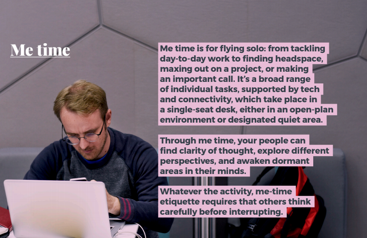
This led to the concept of spaces that could support shared time, we time and me time.
And a set of principles to make this concept work:
It's everywhere - not just for the city centre office
It's flexible and for everybody - for customers and employees, recognising we are all different
It's grounded and efficient - to enhance productivity and service
It's social and connected - connections and connectivity to fuel collaboration
It acknowledges the natural environment - natural materials, fresh air, daylight, greenery
It shows respect for the environment - materials and technology that enhance sustainability
It lifts the spirits - small details create opportunities to delight
These principles formed the basis of the design brief for our workspaces.
Step 2 - Test the ideas
White Willows & The Meadows, designed by Matt Hall, a-i-a studio, 2018
Test and learn is a key part of our approach to innovation.
In this spirit we asked Matt Hall to help us design new workspaces at two of our supported housing sites which act as hubs for different teams. His work provides a great demonstration of the principles in IF Collective's report:
It’s everywhere - these were small spaces ideal for a test. Because the workspace in each case was located within a residential setting, the design emphasises home.
It’s flexible and for everybody - these tiny spaces have been repurposed to offer a broad range of workspace: meeting rooms, shared desks, standing desks, touchdown space. These serve people based in the building, as well as people in floating support services.
It’s grounded and efficient - ingenious storage solutions remove clutter whilst maximising space. White walls bring light, new flooring reduces the noise levels.
It’s social and connected - break out spaces and dining spaces offer opportunities to socialise and connect.
It acknowledges the natural environment - window seats give views to the garden, a roof garden creates an option for eating outside. Plants bring greenery inside.
It shows respect for the environment - reusing second hand furniture gives an opportunity for mid-century design classics alongside a range of bespoke CNC plywood furniture - benches, modular peg walls, shelving - made locally in Sheffield by Reddit and Chop Shop (who also manufactured our WikiHouses).
It lifts the spirits - the fabrics echo the colours of South Yorkshire: brick red, sandstone yellow, grassy green. Pictures on the walls are by contemporary Yorkshire artists of Yorkshire scenes including our very own Jonny Wilkinson.
Step 3 - Apply the thinking and learning
152 Rockingham Street, by BDP (architect), 93ft (interior design), Preston Barber (M&E), IF Collective, brand 2019
The design of our city centre workspace also exemplifies IF Collective's principles, not surprising given that Andy Turner has been part of the design team.
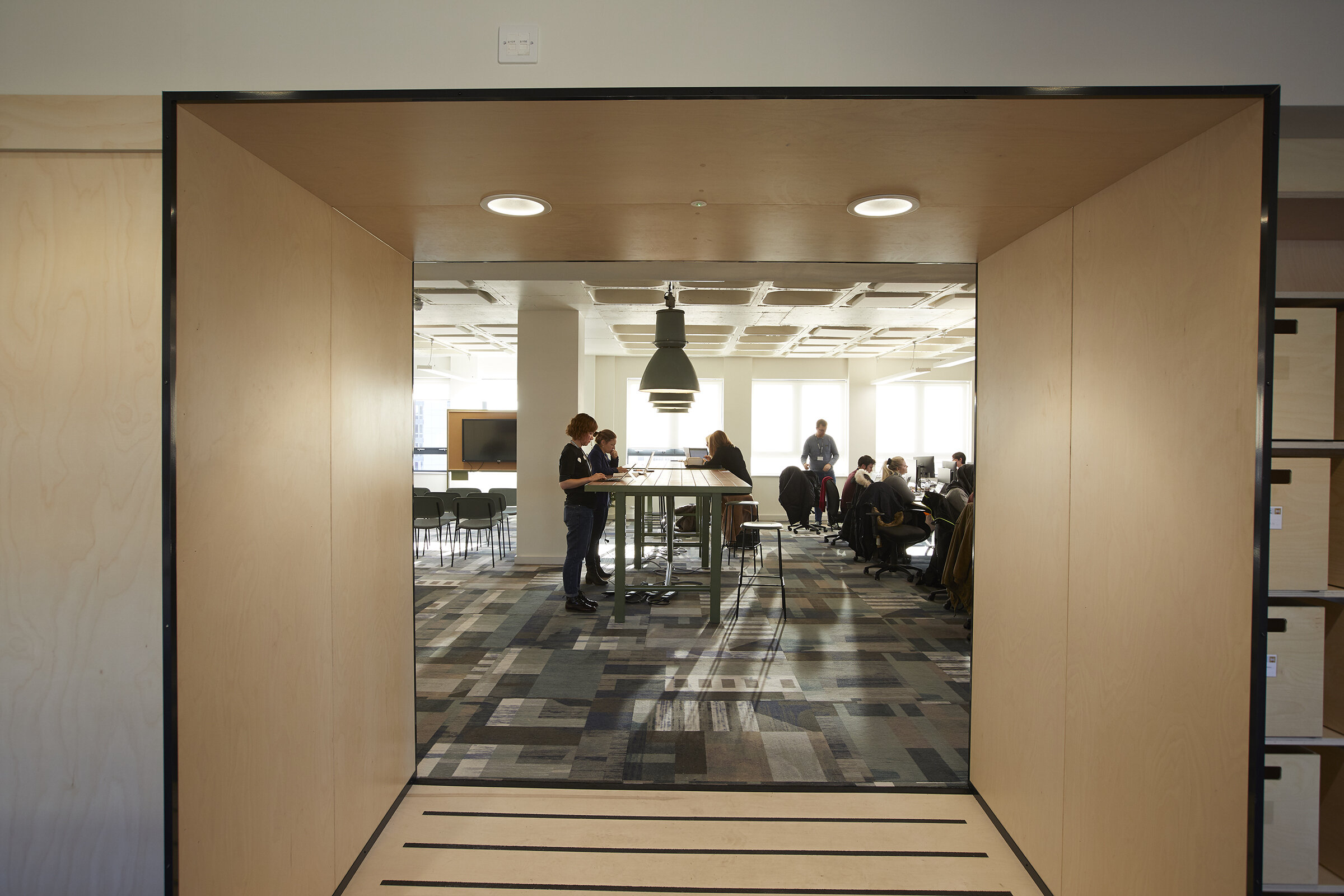
It’s flexible - the building is grounded in flexibility: a data floor allows us to reconfigure the work stations, there are as few partitions as possible, folding screens and moveable furniture allow us to adapt meeting and collaboration spaces.
It’s for everybody - there are different kinds of workspace to suit different styles of working and to accommodate people who aren't based here all the time: large shared desks, high tables, me/we snugs, break out areas, spaces for presentations, project work and stand-ups, pin-up space, quiet rooms, co-working spaces, window seats for reflection.
It’s grounded - the concrete waffle ceiling has been exposed on all floors and is the inspiration for the gridded layout of the furniture and other spaces. It has other functions: high ceilings create more daylight and the concrete slab is used to warm and cool the building.
It’s efficient - above ground floor the space is organised around the main spiral staircase and a wall made of ply which separates the facilities on each floor (toilets, showers, kitchens, cloakroom, personal storage) from the open office/events space. These three floors are largely private, the engine room of the building.
It’s social - the ground floor is social like the ground floor of a home: reception, lounge, kitchen/dining area at the front with a suite of meeting rooms at the back. The top floor is a "pavilion" perched on top of the building with an events space, roof garden and window seats with long views south over the city.
It’s connected - there is connectivity throughout the building, digital screens in reception and the stairwell, screens in meeting rooms, speakers for soundscapes.
It acknowledges the natural environment - planting at the main entrance continues up the stairwell and in generous window boxes to the roof garden, from where are long views to the Peak District. Opening windows provide natural ventilation, with cool/warm air ducts hidden in the bulkhead above the ply wall.
It shows respect for the environment - double glazing and a new roof are energy efficient and the roof is strong enough to allow us to move the photovoltaic panels from our previous home. There are cycle racks and charging points for electric cars in the car park. Much of the furniture is bespoke and made in Sheffield and includes recycled and sustainable materials, timber and ply.
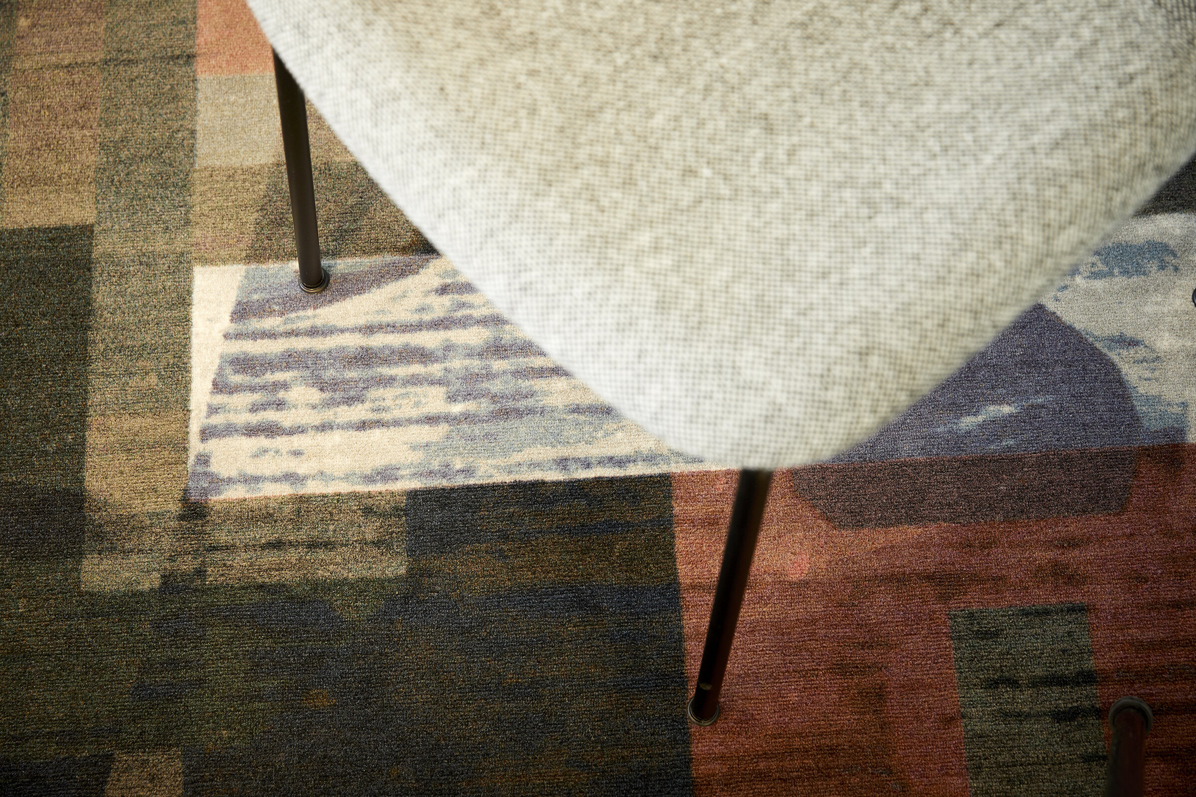
It lifts the spirits - there are plenty of small details to delight: the spine wall shelving on the open plan side houses plants, books and information about all of our many services; there is a library spread across all five floors with books related to the teams and activity on each floor; a series of lightboxes on the ground floor and in the stairwell tell our story through still and moving images and sound. The simplicity of the layout and décor is offset by a bespoke carpet that references our homes and gardens, designed by Jonny Wilkinson.
Here's how our workspace expresses our purpose
Settle + here for the long term
“New office is amazing – feel so settled already.”
Our satellite offices are in buildings we own. At Rockingham Street we have traded a building with a relatively short lease for a 240 year lease (and we hope to acquire the freehold from the council): we want an asset that will serve our customers well and help us to be here for the next 50 years. These are brick buildings that feel grounded and solid. We have adopted a progressive approach to equality and diversity and to environmental sustainability.
Live well + joy
“Honestly, I can’t describe how unbelievably lucky I feel to work in such an inclusive, friendly and modern space. It’s improved my wellbeing. I enjoy coming to work.”
We have opted for natural ventilation, plenty of daylight, lovely places to eat and socialise. The décor is calm and comfortable, there are spaces that support wellbeing and learning. We have created roof gardens and balcony planting that reflect the landscaping around our homes.
Realise your potential
“It has changed my working life. I have spoken to more people across the organisation in the last few weeks than I have done in the last three years!”
All of the workspace has been designed to enable a radical change in how we work and to help our business realise its potential. Whilst the interior is beautiful - one employee described it as "gorgeous" - everything is functional, there are no frills or extras. The furniture is flexible and can be adjusted and reconfigured. Different kinds of spaces support me/we/shared time, quiet work, collaboration, small and large meetings and events. Beautifully curated library spaces allow for learning and personal development.
And here’s the impact
“The ground floor is phenomenal, the space for our customers, the facilities, the comfort and how it makes you just want to come in and settle down.”
There are spaces to share with our customers; all of our employees; and across organisational boundaries with our many partners. We are already seeing a positive shift in our relationships with all of these people and tangible benefits to our customers through their use of the buildings.
For more details on what our new workspace at Rockingham Street is like and the impact it is having please visit this blog.
And look out for a future blog on the design of Rockingham Street when we have the chance to get back into the building, finish it off and take some more photographs!


